The Box of Donuts
My Process
1. Research Across 16 Business Units
I worked with Asish, our Business Analyst, to figure out what was actually broken:
39 user interviews (sales reps, directors, regional managers)
41 survey responses
16 business units globally
What we found:
Problem 1: Call plans took forever
Too many required fields
Couldn't save drafts
Multiple clicks for simple tasks
Problem 2: Information overload
Tables showed everything at once, no way to customize
Bad visual hierarchy
No control over how much data appeared per page
Problem 3: Hidden features
No bulk actions, had to edit records one by one
Export function buried
What users told us:
"It's not that I hate documenting. The tool makes it painful."
"I spend more time fighting the interface than selling."
These findings drove every design decision.
2. Built Nexa's First Design System
Before touching wireframes, I built what should have existed from the start: a design system.
What I created:
Color palette (primary, secondary, error, success)
Typography system (switched to Lexend Deca for readability)
Component library (buttons, forms, tables, modals, notifications)
Interaction patterns (hover, loading, empty states)
Spacing and layout grids
I owned the entire system, including research, components, and documentation. I wrote rules for everything: which button to use when, how to apply colors, and component usage. The next designer wouldn't start from zero like I did.
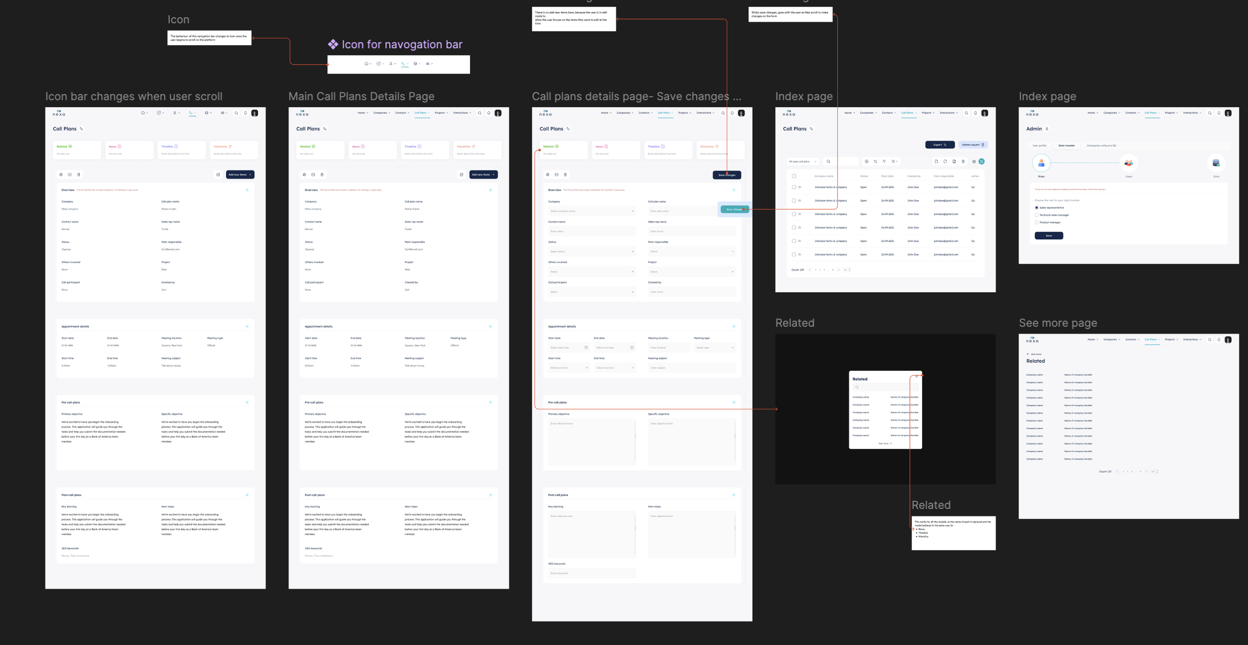
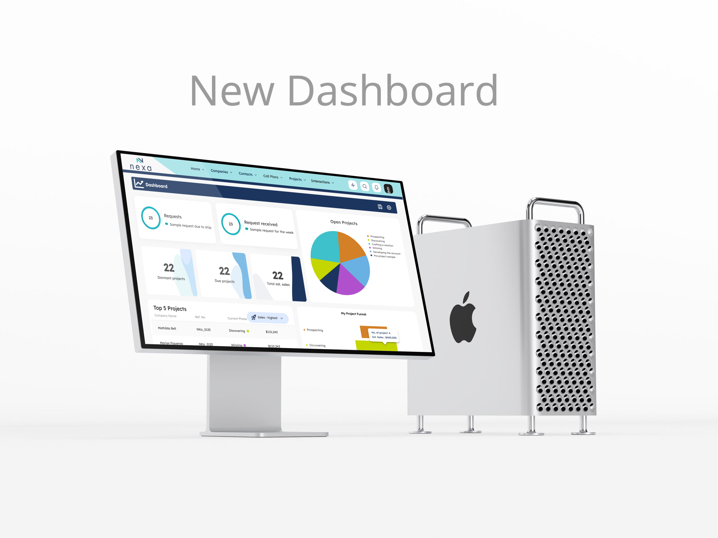
3. Redesigned Core Features
I created all wireframes and high-fidelity mockups. Ran 5 stakeholder design reviews.
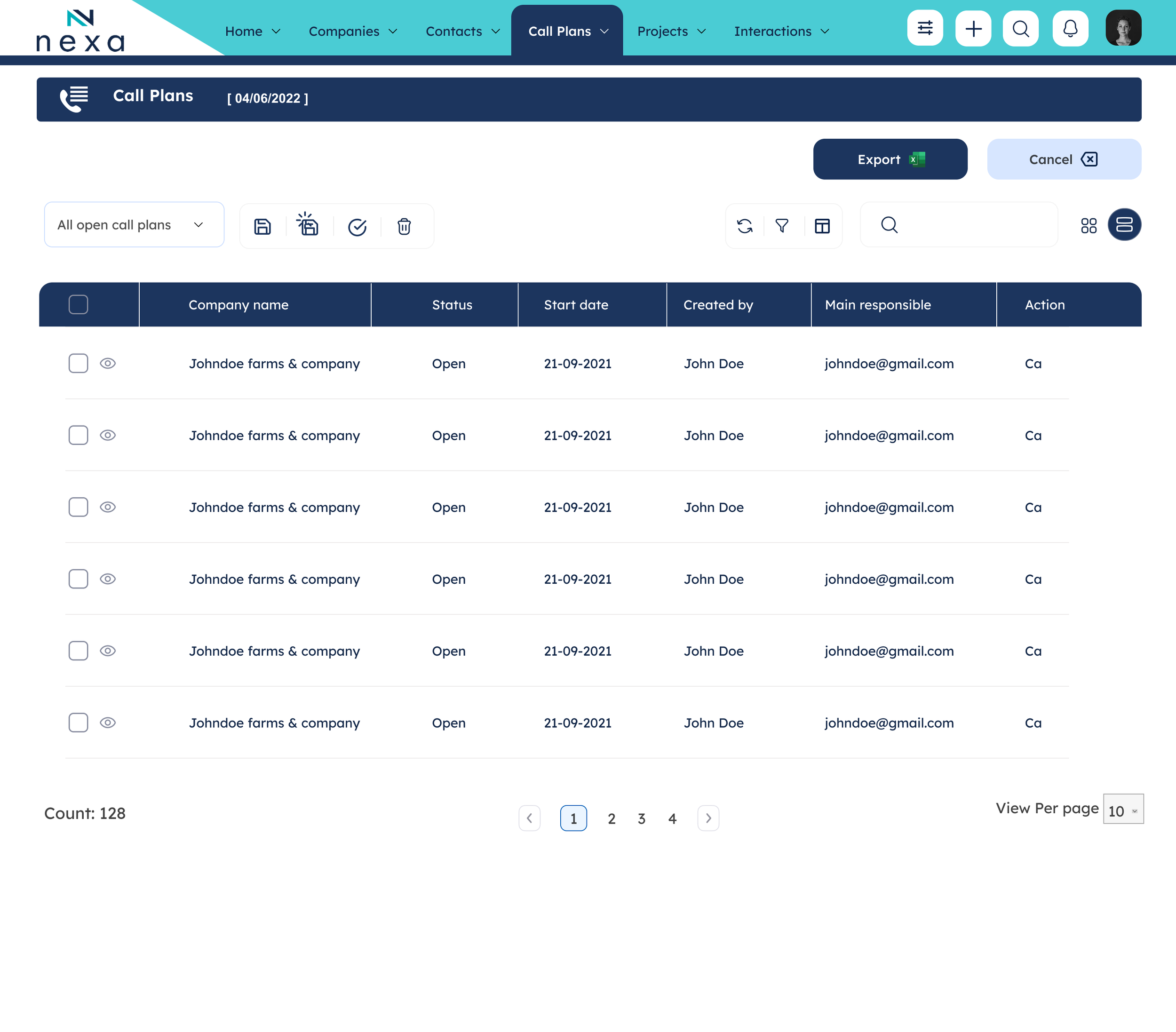
Index Pages (Companies, Contacts, Projects)
The challenge: Users needed to see more information and perform bulk actions. The old interface forced one-by-one editing.
My solution:
Added checkboxes for bulk actions (edit 10 records at once vs. one by one)
Implemented customizable pagination (users choose 10, 25, 50, or 100 records per page)
Moved "Create New" button to persistent top navigation
Replaced text buttons with icon buttons to reduce visual noise
Unified filtering system across all index pages
Prominent search in top navigation
Impact: Users reported seeing 40% more information per screen without needing to scroll.
4. Iterated Based on Feedback
I ran weekly design reviews. Here's what changed:
Iteration 1: "Make it sexy"
Stakeholders wanted more polish. I added white space, fixed color contrast, and improved typography so content was easier to scan.
Iteration 2: Developer constraints
Luke and Robert told me inline editing wouldn't work with our database. I switched to a lighter save mechanism that fit the technical limits without breaking the user experience.
Iteration 3: More customization
Early testers wanted more control. I added a column chooser for tables, saved filters, and default views so users could set up their own workspace.
Working with Nandhi (QA) during testing caught edge cases I would've missed. We launched with zero critical bugs.
The Impact
The Impact
By the numbers:
Call plan creation: 8 clicks → 3 clicks (62% reduction)
40% more information visible without scrolling
65% of users said tasks felt "much easier" post-launch
Zero critical bugs at launch
100% adoption across 16 business units in the first month
What users said:
"I like the new designs. Using it doesn't feel like a chore anymore."
"This interface is tidier. Buttons are in a better place."
"Can see more info in one view. A few clicks and you can see more information."
And someone sent me donuts. That anonymous thank-you reminded me design isn't just about pixels—it's about making work better.
What I Learned
Joining late gave me fresh eyes
Not being embedded in seven years of decisions meant I questioned everything. "Why does this work this way?" became my most useful question.
Involve developers during wireframing, not after
If I'd brought Luke and Robert into early sketches, we could've designed solutions that were both good-looking and technically feasible. Would've saved the rework in iteration 2.
QA is your design partner
Nandhi caught edge cases I wouldn't have thought about—like what happens when someone has 20 saved filters? Working with QA early means designing for real use, not just ideal scenarios.
Documentation protects the next person
I documented every decision so the next designer wouldn't start from zero like I did. That matters more than the pixels.
What's Next
The redesign is live across all 16 business units.
I'm leading ongoing improvements, including updating the design system based on analytics, designing new features (such as marketing widgets and improved search), and refining interactions based on how people actually use it.
The donuts still matter most. When users thank you for making work easier, you know you solved the right problem.
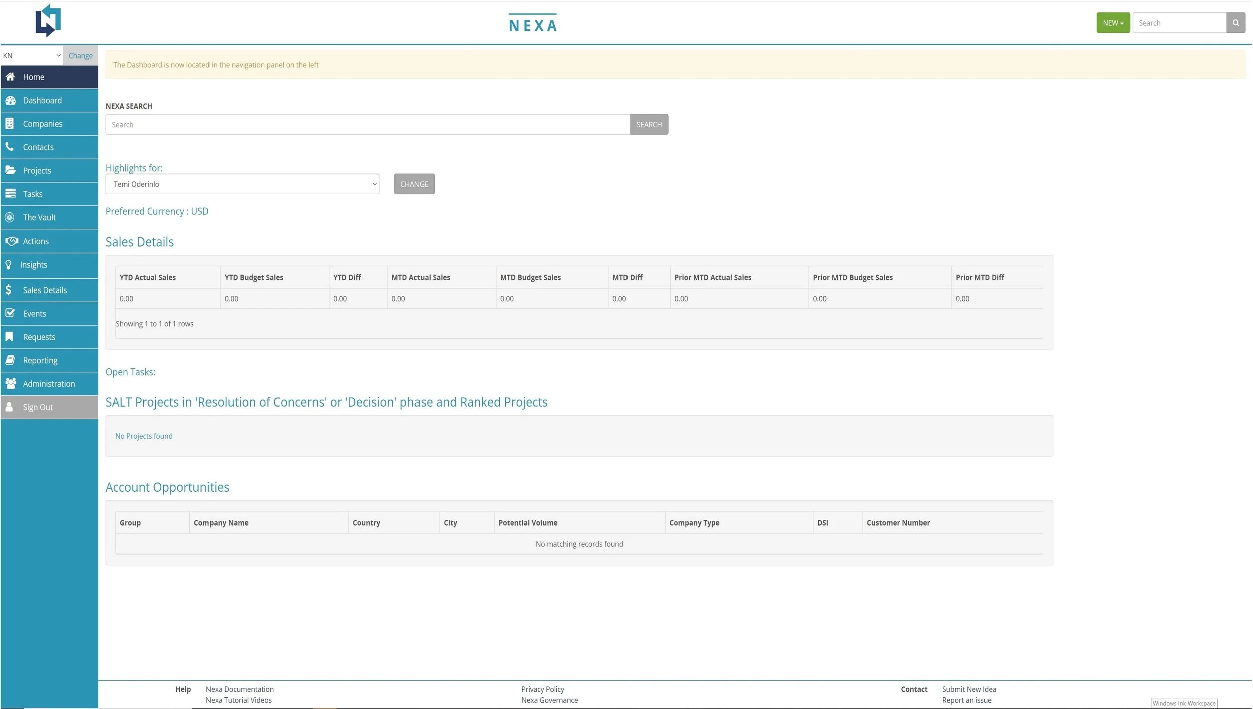
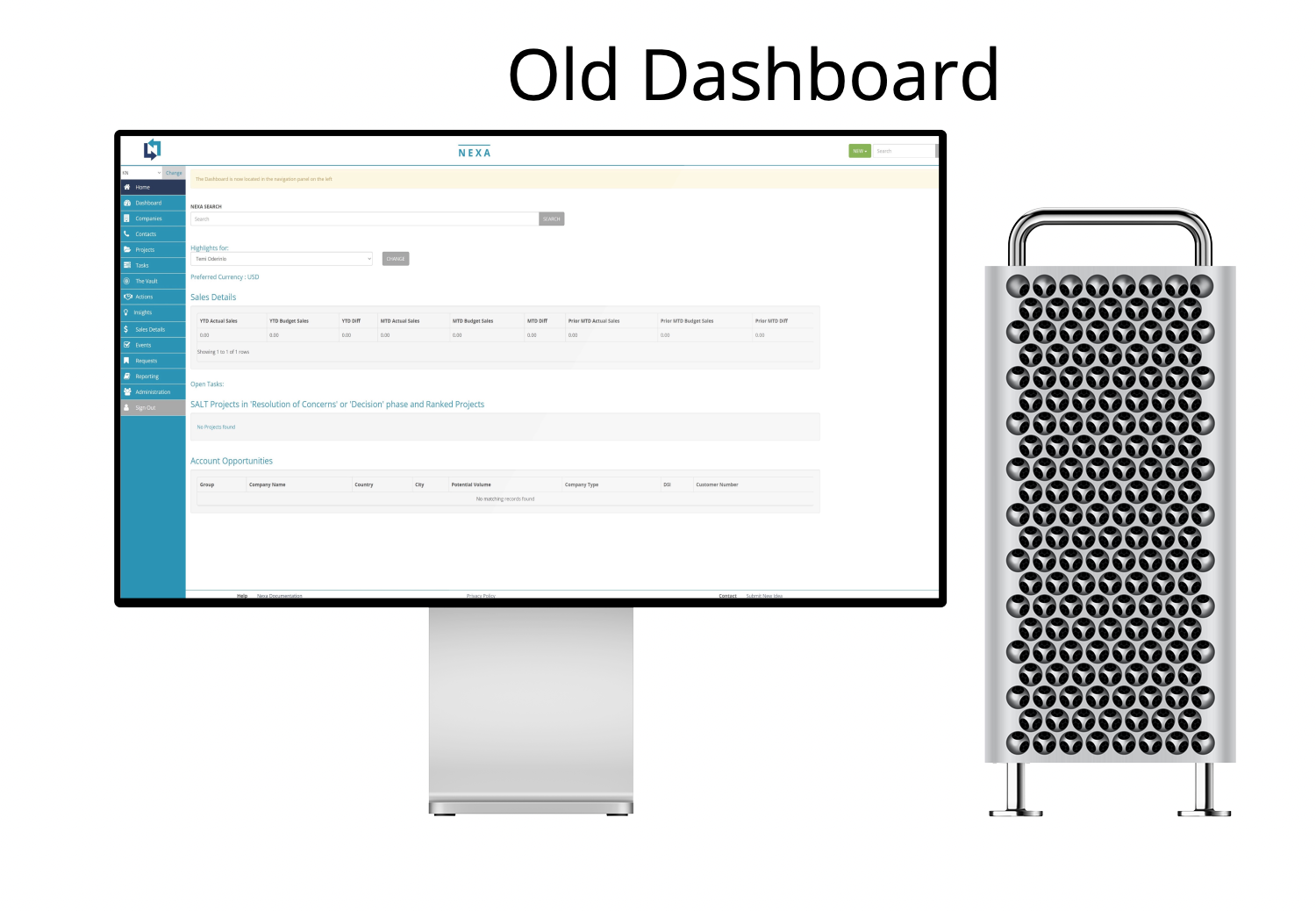
The Problem
Nexa is Kemin's internal CRM. Sales teams across 16 business units used it every day, and they hated it.
The feedback was brutal:
"Using it feels like a chore."
"Too many clicks for simple tasks"
"Looks like software from 2010"
"I can't find the features I need."
A week after we launched the redesign, a sales rep sent me a box of donuts. The note said: "Thank you for making my life easier."
Timeline: 16 months
My Role: Lead UI/UX Designer
Team: PM, Tech Owner, Senior Dev, 2 BAs, QA, App Manager, Dev Manager (9 people)
Tools: Figma, Miro, Optimal Workshop