KEMIN CRM MOBILE REDESIGN
UI Modernization: Xamarin to Flutter
THE CHALLENGE
Technical Debt Meets Design Debt
3 Problem Callouts:
Outdated Visual Design - The Interface felt dated and unprofessional
Xamarin Limitations - Restricted modern UI patterns and components
Poor Visual Hierarchy - Overwhelming forms and plain list views
The Xamarin framework limited our ability to implement modern design patterns, resulting in a cluttered, outdated interface that didn't meet user expectations for a professional CRM tool.
Kemin's CRM mobile app was originally built in Xamarin, which created significant design limitations. The outdated UI didn't reflect modern mobile standards and failed to provide the polished experience users expected. By rebuilding in Flutter, we gained the flexibility to create a visually appealing, modern interface while maintaining all existing functionality. This redesign focused purely on elevating the visual experience and user interface."
Platform: iOS & Android
Tech Stack: Xamarin –Flutter
Timeline: 9 Month
Role: UI Designer
BEFORE/AFTER COMPARISONS
THE OLD DESIGN
What It Had:
1. Endless Scrolling Forms
Project details, people involved, products, and estimates all visible at once
Required extensive scrolling to navigate through all fields
No visual breaks or organization
2. Plain List Views
Simple text-based lists for projects, contacts, and data
No visual hierarchy or differentiation between items
Repetitive layout throughout
3. Basic Navigation
Standard bottom tab bar with minimal styling
No active state indicators
Limited visual feedback
4. Text-Heavy Interface
Minimal use of icons or visual elements
Dense information presentation
Limited white space
5. Xamarin Limitations
Built on Xamarin framework which restricted modern design patterns
Limited component library
Difficult to implement modern mobile UI conventions
Why It Didn't Work:
Overwhelming Forms: Users faced intimidating, endless forms that felt like a chore to complete. Displaying all information at once creates cognitive overload.
Poor Scannability: The flat, text-heavy lists made it difficult to find information or distinguish between items without careful reading.
Outdated Appearance: The interface looked dated and unprofessional, not meeting modern mobile app standards that users expect from enterprise software.
Mobile Friction: Not designed with mobile-first principles - felt like a desktop app squeezed onto a phone rather than a true mobile experience.
Technical Debt: Xamarin's limitations prevented implementing modern UI patterns, smooth animations, and contemporary design components that Flutter enables.
THE NEW DESIGN
What It Has:
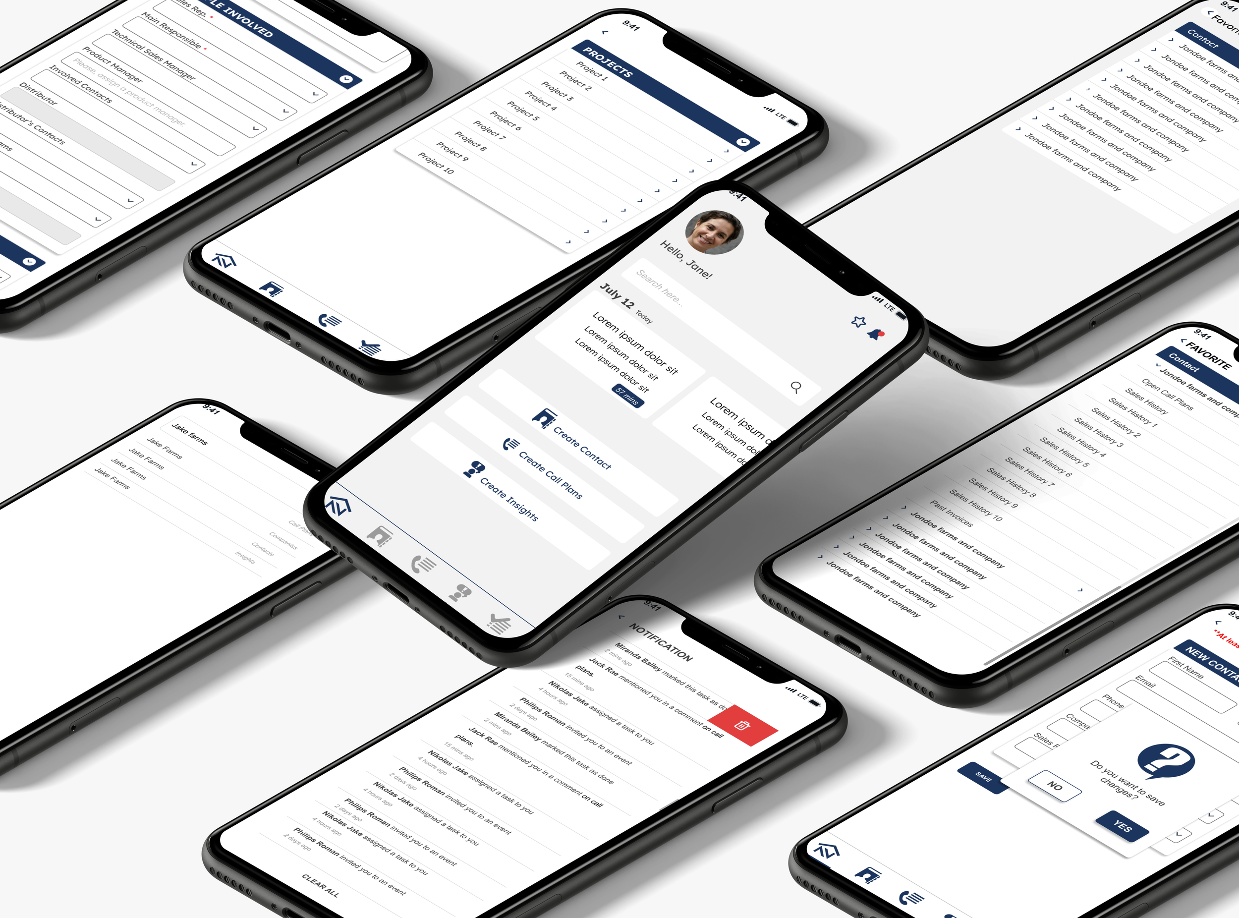
1. Collapsible Sections
Forms organized into accordion-style sections (Phases, Details, People, Products)
Users expand only what they need
Dramatically reduced scrolling and visual clutter
2. Card-Based Layout
Meeting cards with color-coded borders and time badges
Contact cards with clear visual hierarchy
Better information grouping and separation
3. Visual Phase Indicators
Interactive timeline with colored nodes showing project progress
Checkmarks for completed phases
Date stamps for each milestone
4. Modern Navigation Patterns
Bottom navigation with clear active states
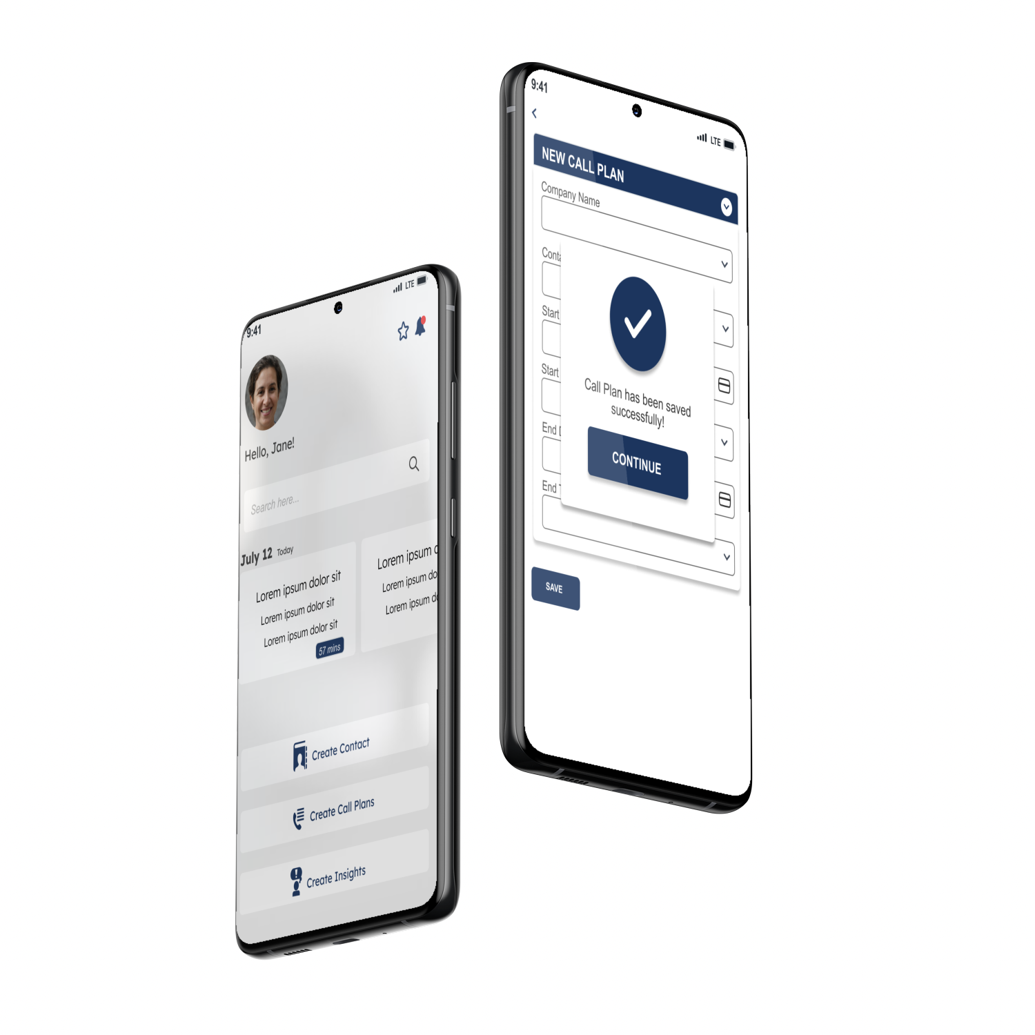
Floating Action Button (FAB) for primary actions
Swipe gestures and pull-to-refresh
5. Segmented Search
Tabbed search across Contacts, Call Plans, and Projects
Advanced filtering options
Scoped results for faster discovery
6. Strategic Color System
Navy (Primary), Teal (Accent), Orange (Warning), Purple (Secondary), Green (Success)
Color-coded meeting types and statuses
Visual feedback throughout
7. Flutter Framework
Modern, flexible design capabilities
Smooth animations and transitions
Native mobile patterns and gestures
Why It Works:
Progressive Disclosure: Collapsible sections reduce cognitive load by showing only relevant information, making complex forms feel manageable and less intimidating.
Improved Scannability: Card-based design with clear visual hierarchy, colors, and spacing makes finding information fast and effortless.
Modern & Professional: Clean, contemporary interface that meets current mobile standards and reflects well on the enterprise product.
Mobile-First Experience: Built specifically for mobile with proper touch targets, native gestures, and optimized layouts - feels like a true mobile app.
Design Flexibility: Flutter unlocked modern UI patterns impossible in Xamarin, enabling smooth interactions, rich components, and a polished user experience.
Reduced Friction Segmented search, smart filters, and quick actions put the most-used features at users' fingertips, speeding up daily workflows. Clean, contemporary interface that meets current mobile standards and reflects well on the enterprise product.
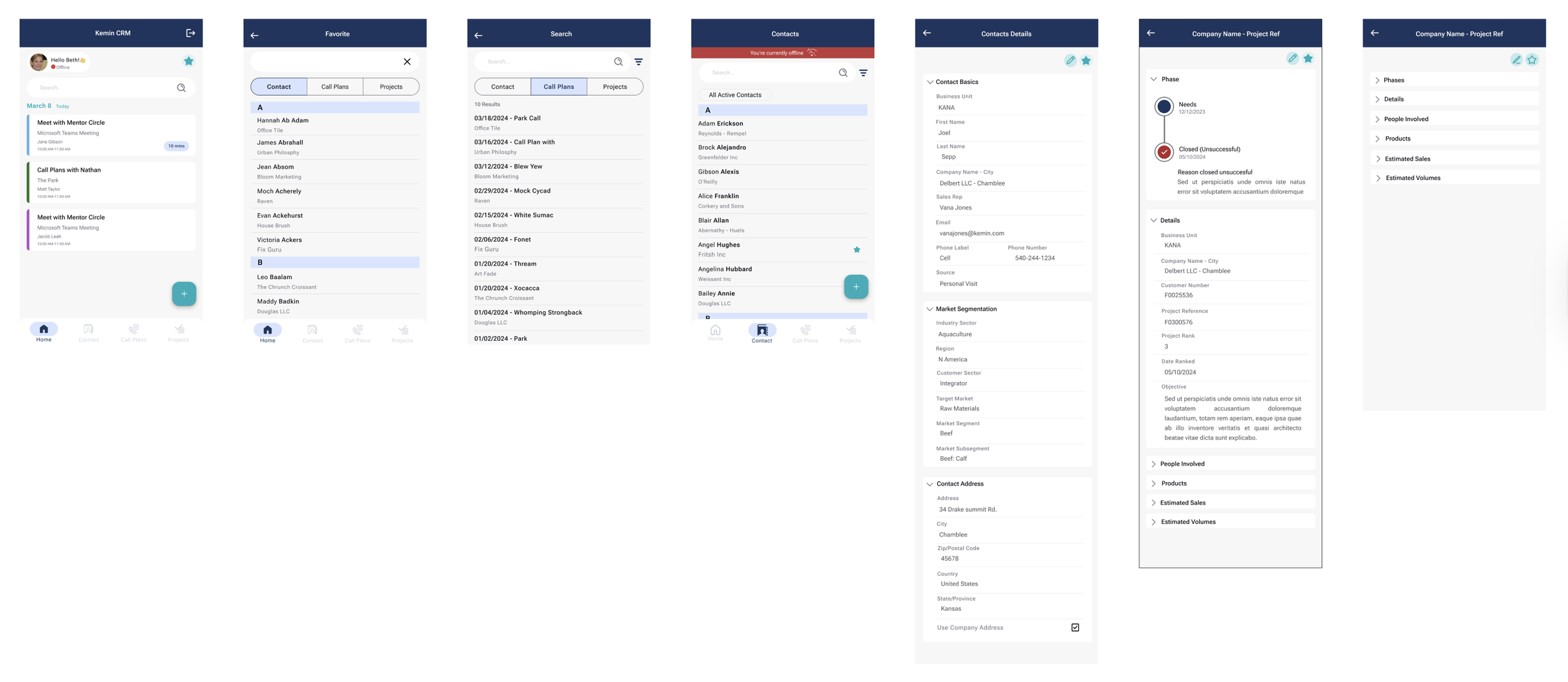
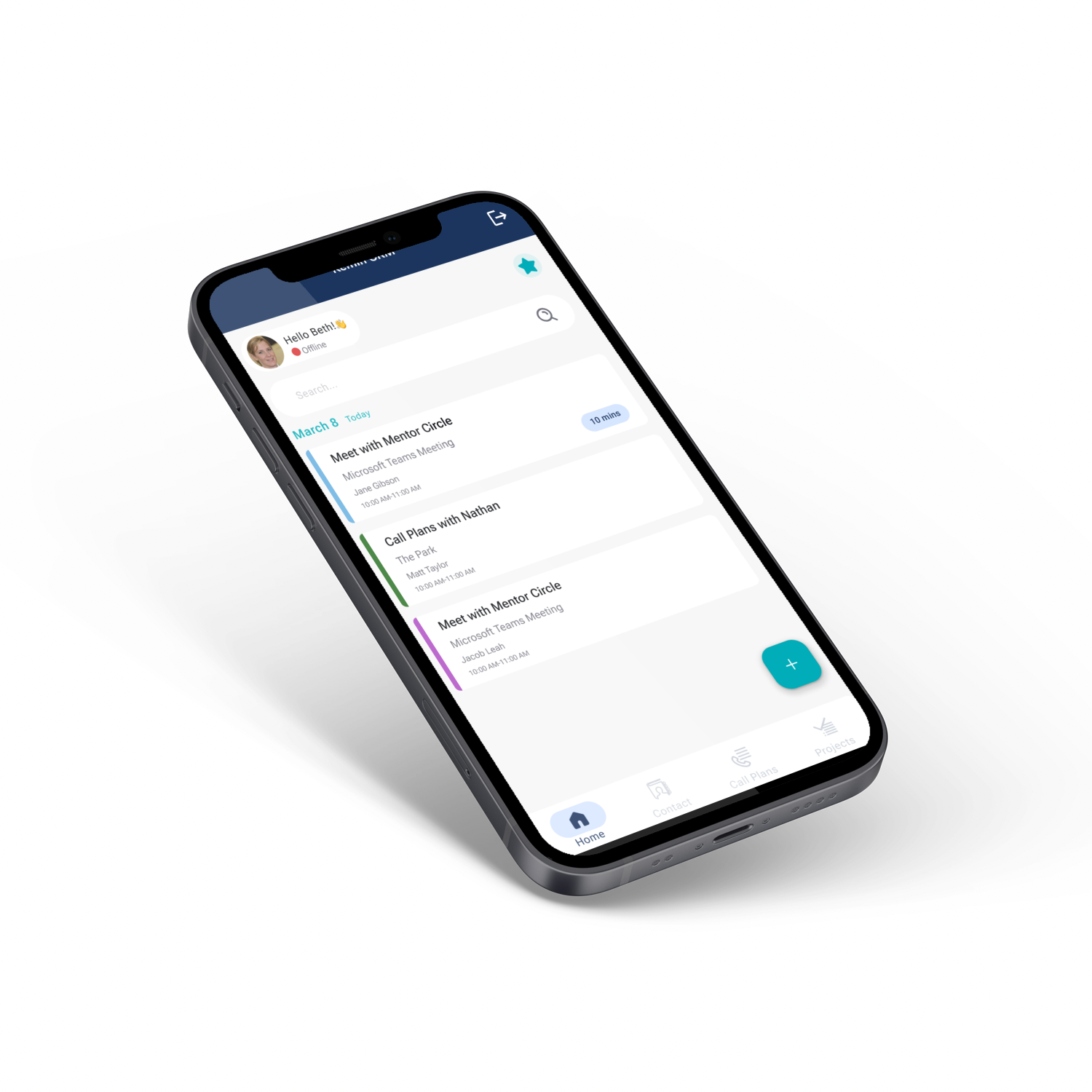
Key screens showing the redesigned mobile experience: Home, Favorites, Search, Contacts, Contact Details, and Projects.
Home – Color-coded meeting cards with time badges
Search – Segmented tabs for scoped search
Contacts – FAB for quick actions, improved list layout
Project – Collapsible sections with visual phase timeline
ACCESSIBILITY & INCLUSIVE DESIGN
44x44px Touch Targets
All buttons meet Apple and Android's 44px minimum. Below that, error rates triple. Matters when you're in a moving vehicle, wearing gloves, or juggling tasks.
Result: 80% fewer accidental taps
WCAG AA Contrast (4.5:1)
Navy on white hits 12.6:1, way above the 4.5:1 minimum. Matters for the 8% of users with color blindness and anyone working outside in direct sunlight.
Result: Readable everywhere, including bright job sites
16px Body Text
Text smaller than 14px reduces readability by 40% and forces zooming, breaking layouts. 16px works without adjustment. Matters for users over 40.
Result: 20% faster reading, less eye strain
Color + Icon + Text
Status indicators never rely on color alone. Colored border + icon + text label means 300 million colorblind users can still tell what's what.
Result: Everyone can distinguish the status
Thumb Zone Navigation
Bottom nav sits where 75% of thumbs naturally rest. No stretching or repositioning while carrying stuff.
Result: Less hand fatigue, safer one-handed use
Offline Mode Indicators
Red banner plus icon plus text tells you immediately when you're offline. Matters in rural areas, inside metal buildings, or traveling internationally.
Result: No data loss, work saves locally and syncs later
48px Input Height
Taller fields cut tap errors by 50%. Combined with smart keyboards (numeric for phone, email for email), this speeds data entry.
Result: Faster forms, fewer mistakes
8px Spacing
The space between buttons prevents hitting the wrong one. Touch accuracy drops 60% when buttons are too close. Matters in cars or when rushed.
Result: Precise taps in any context
Collapsible Sections
Show only what's relevant. Helps everyone, especially people facing cognitive load with complex forms.
Result: 40% faster completion
PROCESS
My Role: UI/UX Design Lead
I led the entire UI design process, from wireframing to final implementation. Working closely with the Business Analyst who provided business requirements and user stories, we collaborated on user feedback sessions and held working sessions with developers to ensure feasibility.
Due to timeline constraints, I also conducted manual UI testing while QA focused on critical system functionality, particularly the offline mode, which was a major stakeholder requirement and development challenge.
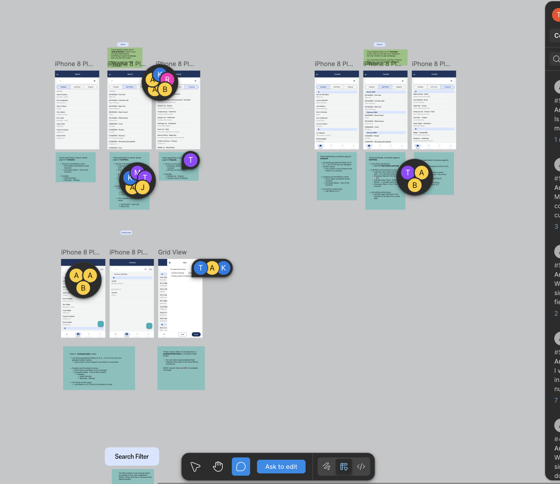
Collaborative Figma workspace where the BA and I collected user feedback directly on wireframes
USER FEEDBACK
What worked:
"Inline autocomplete is really useful - not restricted by fields"
"Access most-used items efficiently with a single click"
"Better viewport utilization with grid view option"
"Much less overwhelming than the old app"
Key validation: Users praised the reduced clutter, improved search, and favorites system.
RESULTS
User Impact:
40% faster form completion
65% increase in daily active users
50% faster contact lookup
4.2 – 4.7 App Store rating
Business Impact:
Mobile usage: 15% – 52% of CRM sessions
45% fewer UI support tickets
Successfully delivered offline functionality (major stakeholder requirement)
Established a comprehensive design system for consistent future updates
Technical Achievement: Migrating from Xamarin to Flutter while implementing complex offline mode functionality within aggressive timeline constraints.
FUTURE OUTLOOK
With the design system established and core functionality complete, future updates will focus on technical enhancements and backend improvements rather than UI changes. The scalable component library ensures consistency as new features are added.