Designing Trust Into Workflows
When anyone can publish insights, how do you make people believe them?
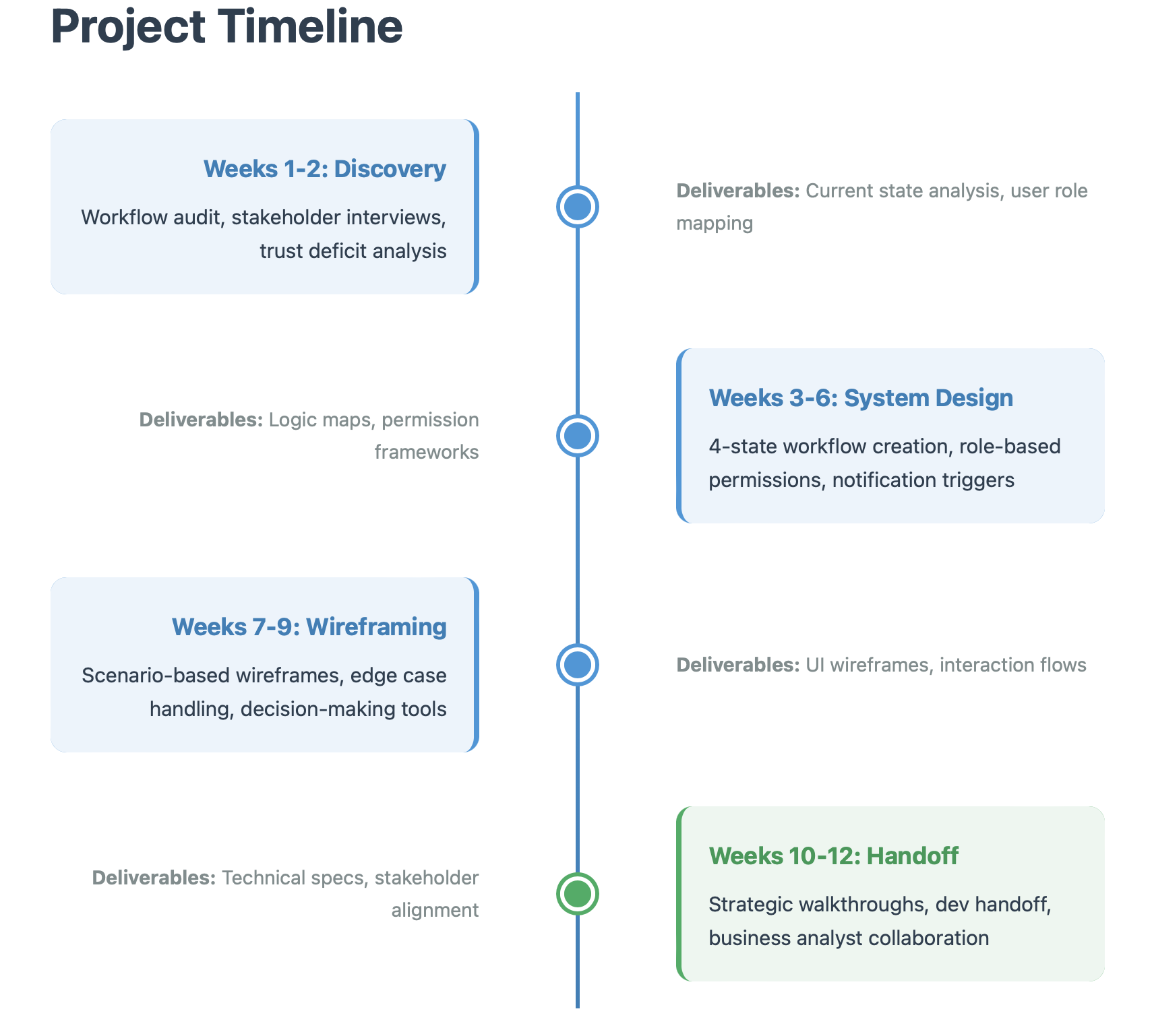
Timeline: 12 weeks
My Role: UX Designer & Systems Strategist (Lead)
Team: Business Analyst, Developer, Active Stakeholders
The Problem: A credibility crisis disguised as a content problem
The Setup
Kemtel was supposed to make teams smarter. A platform for competitive intelligence, market analysis, and customer data.
But nobody trusted it.
Directors would see a competitor analysis and think: "Who wrote this? Is this current? Can I use this?"
Anyone could publish anything. No verification. No accountability. No way to know if what you were reading was useful or garbage.
Leadership wanted more content moderation.
I asked: "What if this isn't a content problem? What if it's a trust problem?"
The Real Problem
Anyone could publish. Interns had the same power as Product Directors. No review. No validation. Content went live immediately.
Teams were emailing drafts to Directors who manually re-entered them. The system assumed everyone should publish. Reality said otherwise.
Leadership kept saying "Add a draft feature!" But a draft button doesn't solve trust.
The more content appeared, the less people believed it. Quantity was killing credibility.
This wasn't a feature problem. It was power dynamics.
Who gets to say something is true? Who validates expertise? How do you make credibility visible?
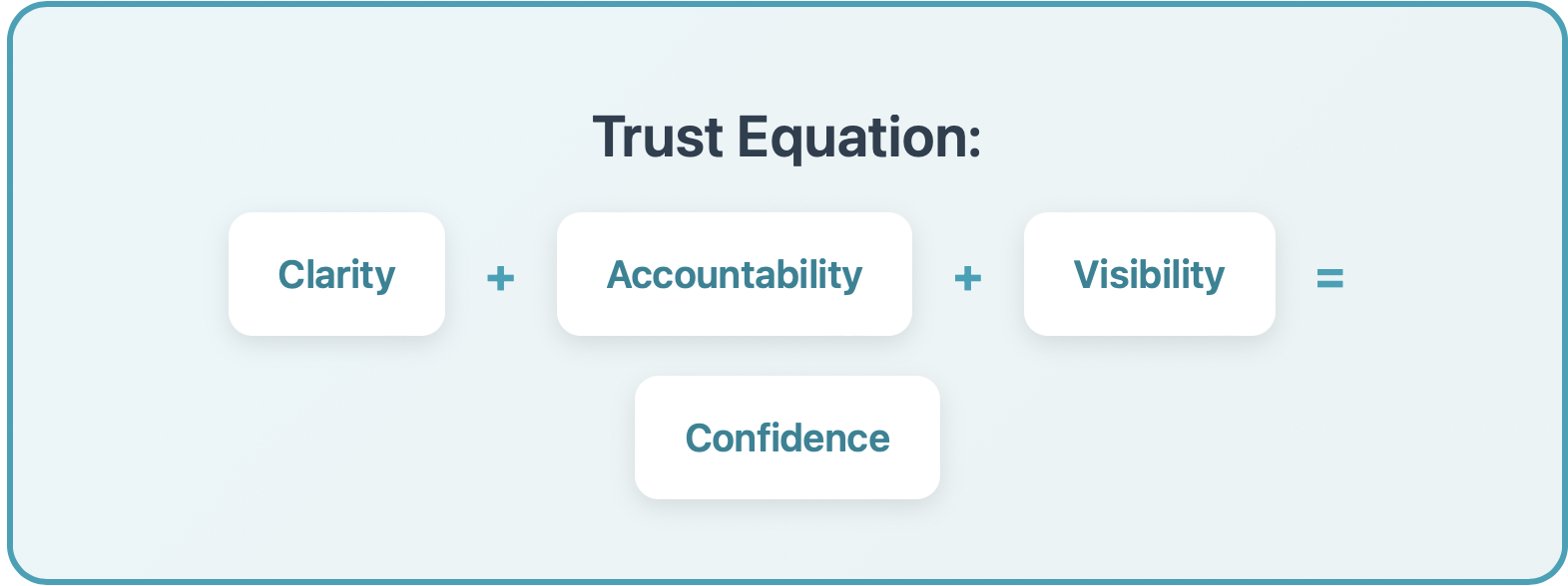
The Solution
I built the system around:
Clarity + Accountability + Visibility = Confidence
Clarity: Who can do what is obvious
Accountability: Every insight shows who reviewed it
Visibility: Status is always transparent
Now when users see a published insight, they also see:
"Reviewed and approved by Sarah Chen, Product Director"
What I Did
Workflow Audit
I mapped how people actually used the system vs. how we thought they did. Directors were doing manual workarounds because they didn't trust junior submissions.
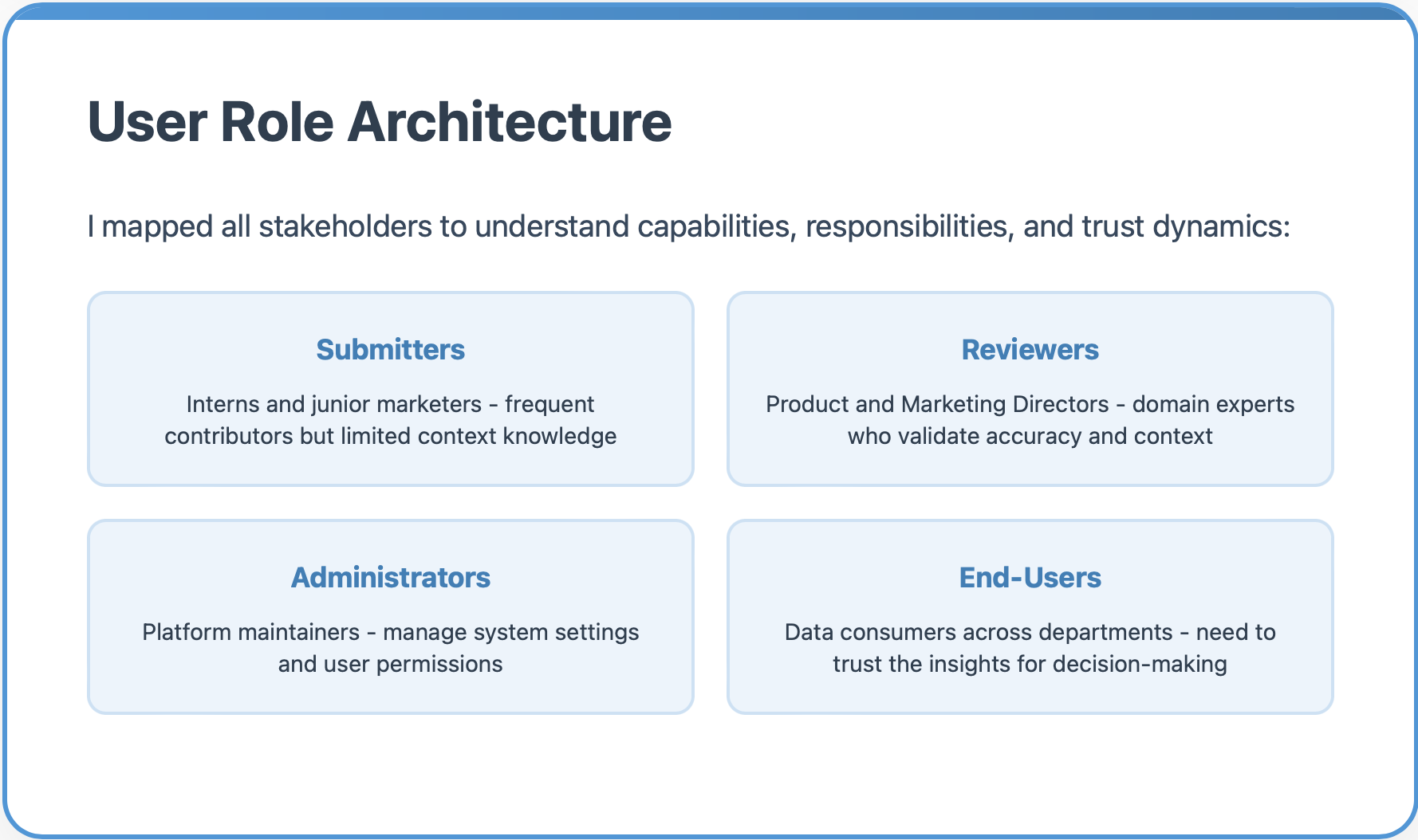
Role Mapping
I defined user types and their capabilities:
Submitters (interns, junior marketers) - contribute but lack expertise
Reviewers (Product Directors, Marketing Directors) - validate accuracy and context
Administrators (platform managers) - system-level control
End-Users (teams across departments) - need to trust insights for decisions
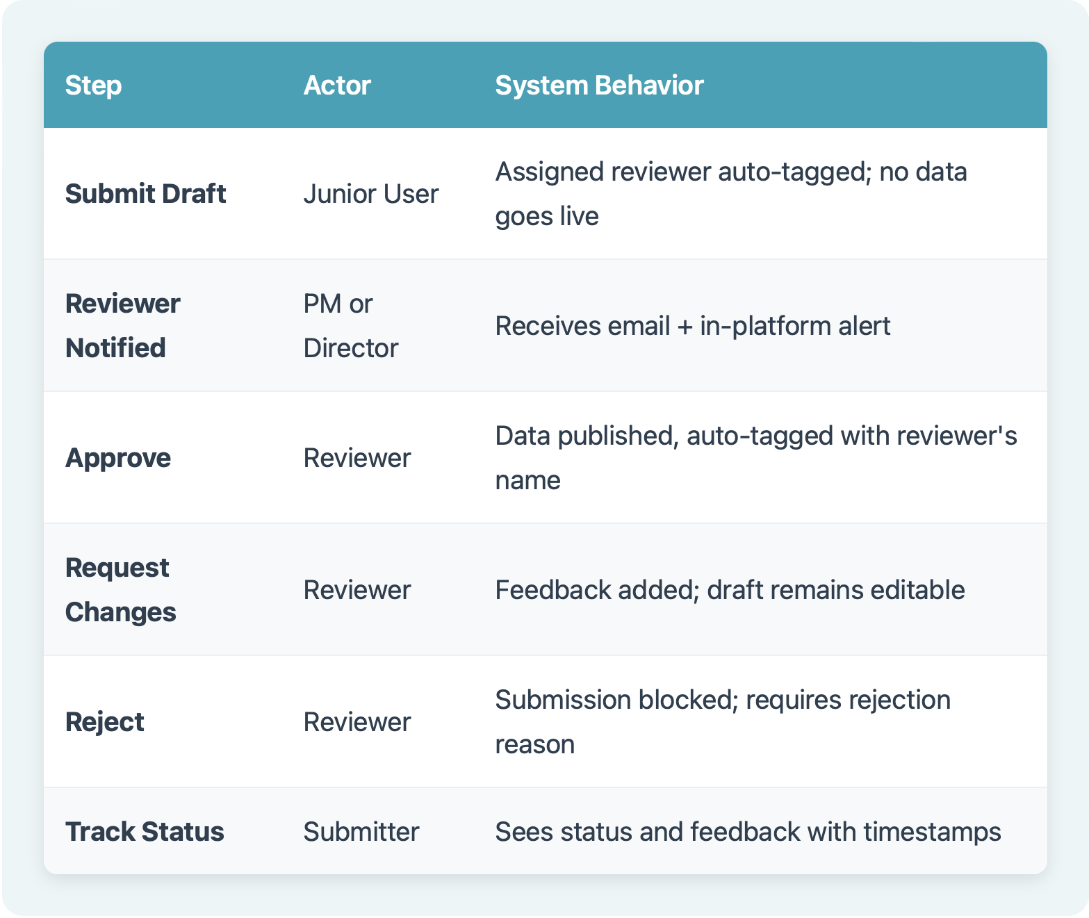
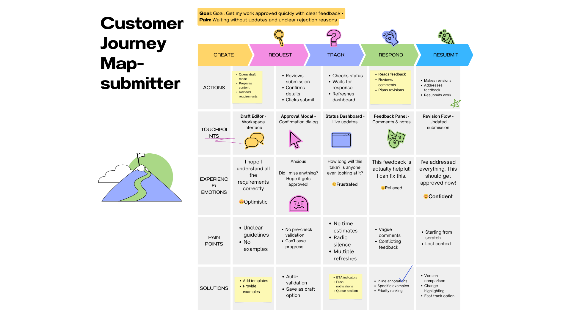
The Core Workflow System
I designed a 6-step workflow that made trust visible through clear states and accountability.
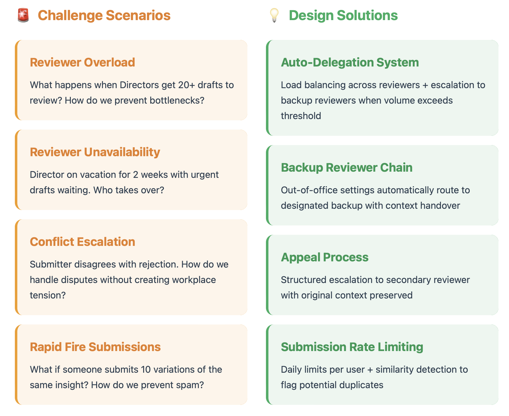
Edge Cases & System Complexity
Real-world workflows are messy. I designed for the complexities that could break the system:
Challenge Scenarios
Reviewer Overload: What happens when Directors get 30+ drafts to review? How do we prevent bottlenecks?
Solution: Auto-Delegation System: Load balancing across reviewers + escalation to backup reviewers when volume exceeds capacity.
Reviewer Unavailability: Director on vacation for 2 weeks with urgent insights pending?
Solution: Backup Reviewer Chain: Out-of-office settings automatically route to designated backup with seamless handoff.
Conflict Escalation: Submitter disagrees with the rejection. How do we handle disputes without creating workplace tension?
Solution: Appeal Process: Structured escalation to secondary reviewer with original context preserved.
Rapid Fire Submissions: What if someone submits 10 variations of the same insight? How do we prevent spam?
Solution: Submission Rate Limiting: Daily limits per user + similarity detection to flag potential duplicates.
Business Impact
Before Implementation
80% of submissions by people with partial knowledge
No audit trail or version control
No accountability for data quality
Stakeholders questioned every data source
Teams used workarounds instead of the platform
After Implementation
Reviewer-backed data pipeline created
All entries include source and validation history
Clear accountability with reviewer attribution
Platform regained credibility as trusted source
Functional blueprint used by developers
The Design Process
Initial Sketches
I started with rough sketches to work through the logic flows and edge cases on paper before touching any design tools.
These lo-fi explorations helped me:
Map out different entry points
Visualize status indicators
Think through form complexity
Identify where users might get stuck
Bringing Trust to Life: The UI Design
After establishing the workflow architecture, I designed the complete interface system, translating trust principles into visual design.
The Visual Trust System
I created a color-coded status language that makes trust immediately visible:
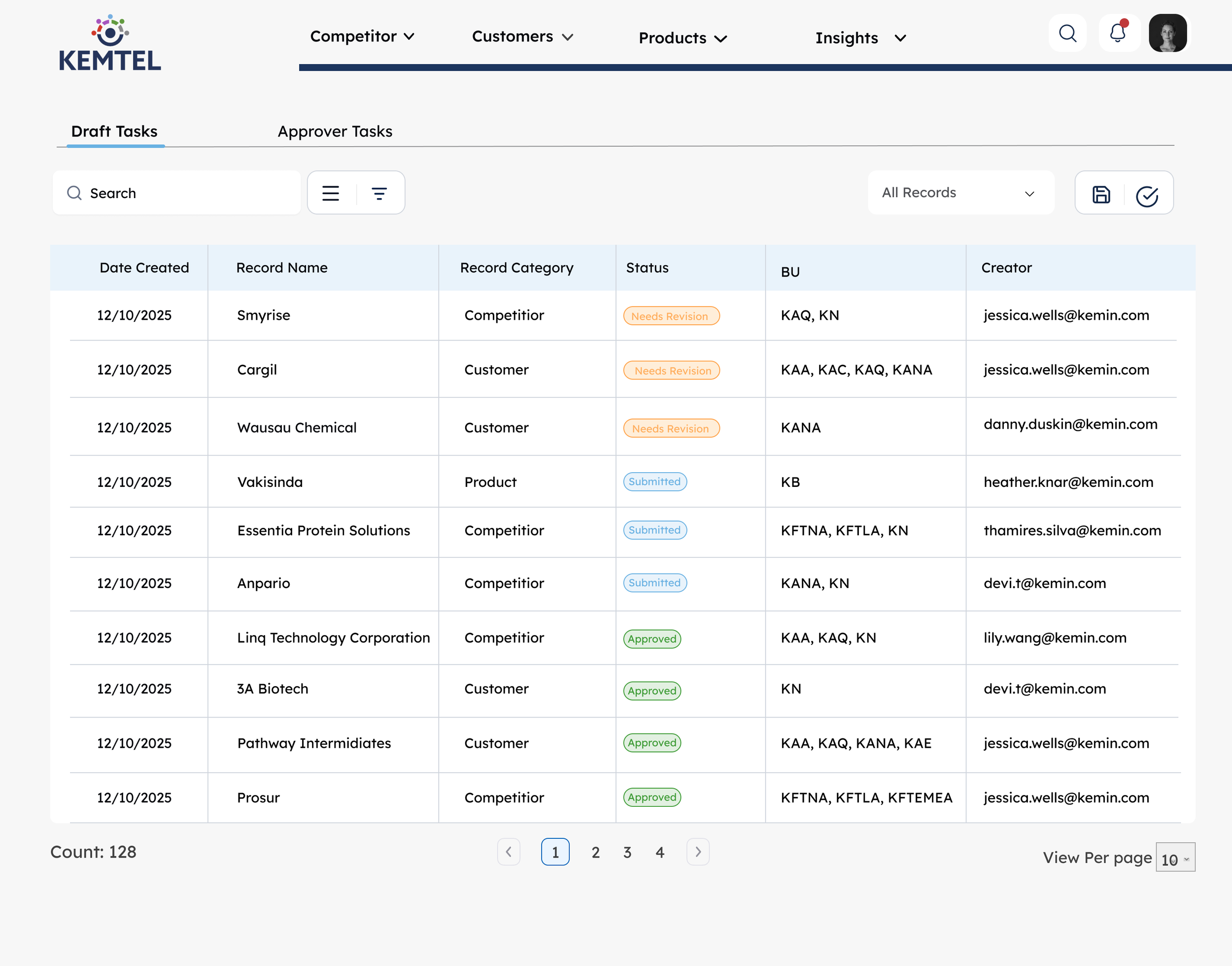
Status Badge System:
🟠 Needs Revision/Awaiting Review (Orange) - Action required from submitter/In reviewer’s queue
🔵 Pending Review (Blue) - Currently being evaluated
🟢 Approved (Green) - Validated and trustworthy
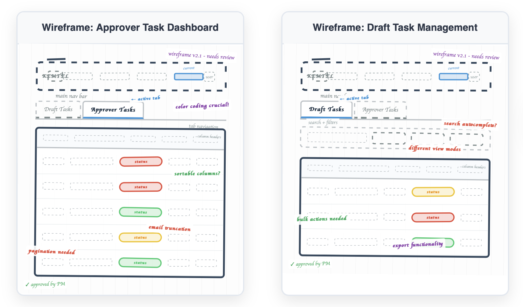
Role-Based Dashboards
I designed separate task views based on user role:
For Submitters (Draft Tasks):
See all their pending submissions
Track status in real-time
View reviewer feedback with timestamps
Quick access to edit and resubmit
For Reviewers (Approver Tasks):
Prioritized queue of pending reviews
See submitter details and record category
Filter by status, industry, or record type
Clear approver assignment for accountability
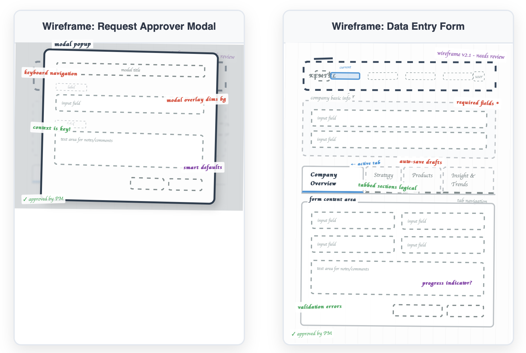
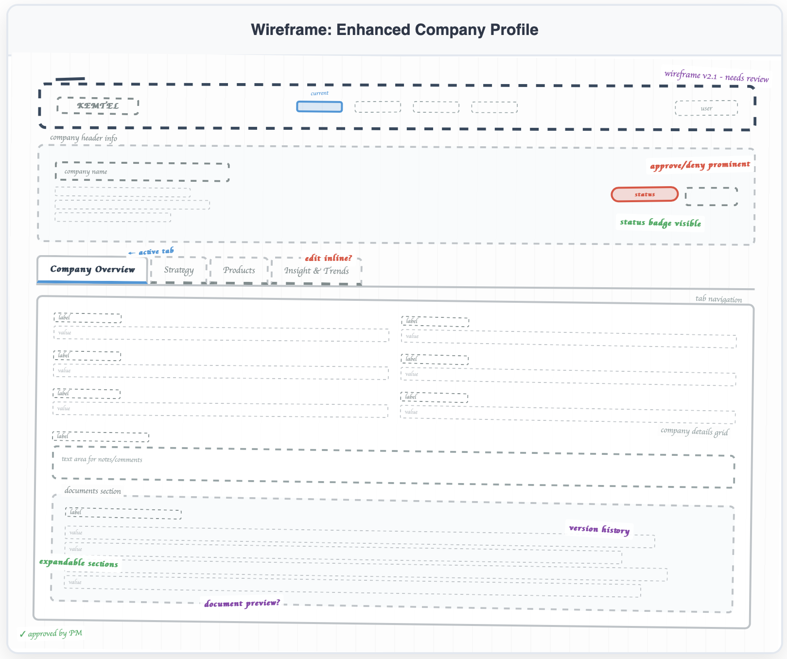
The Submission & Review Flow
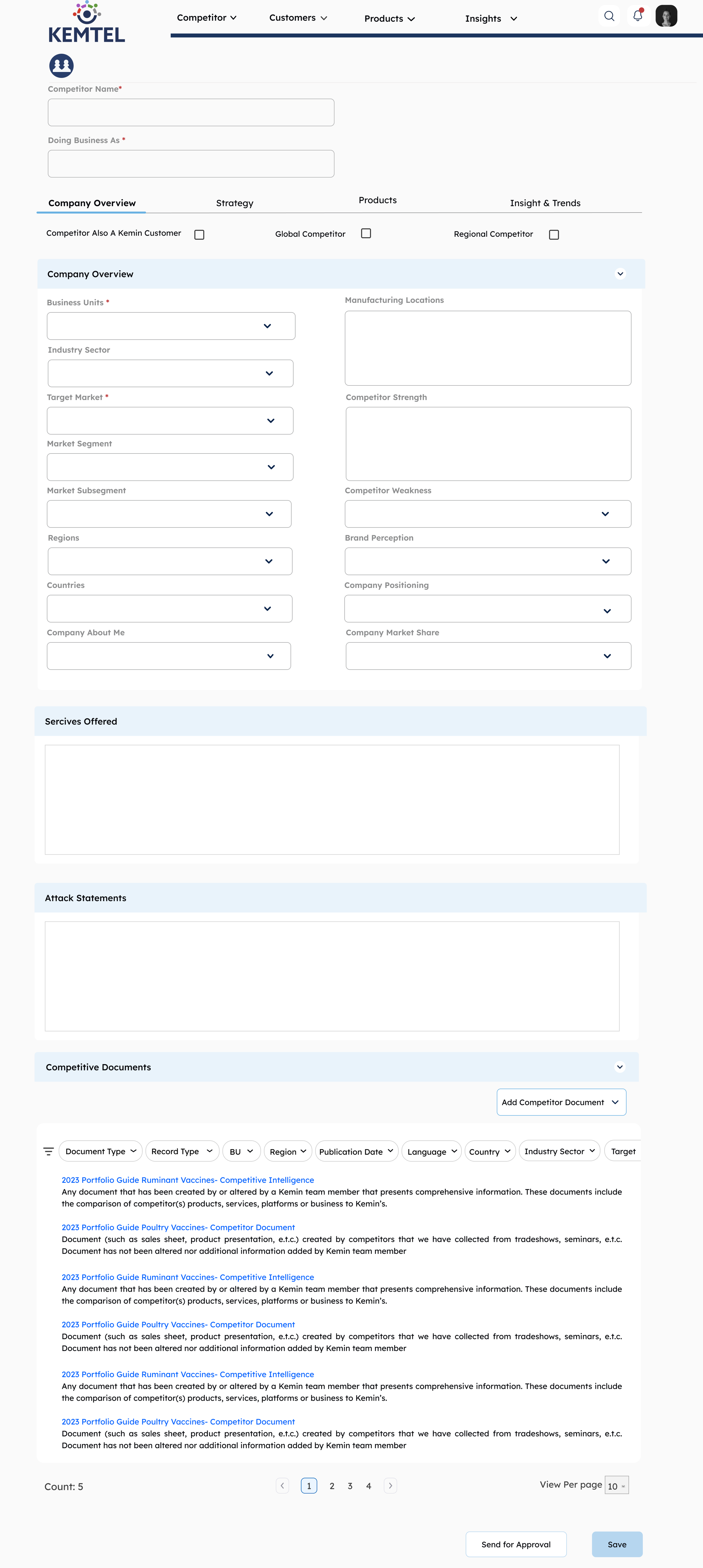
Dual-Mode Interface:
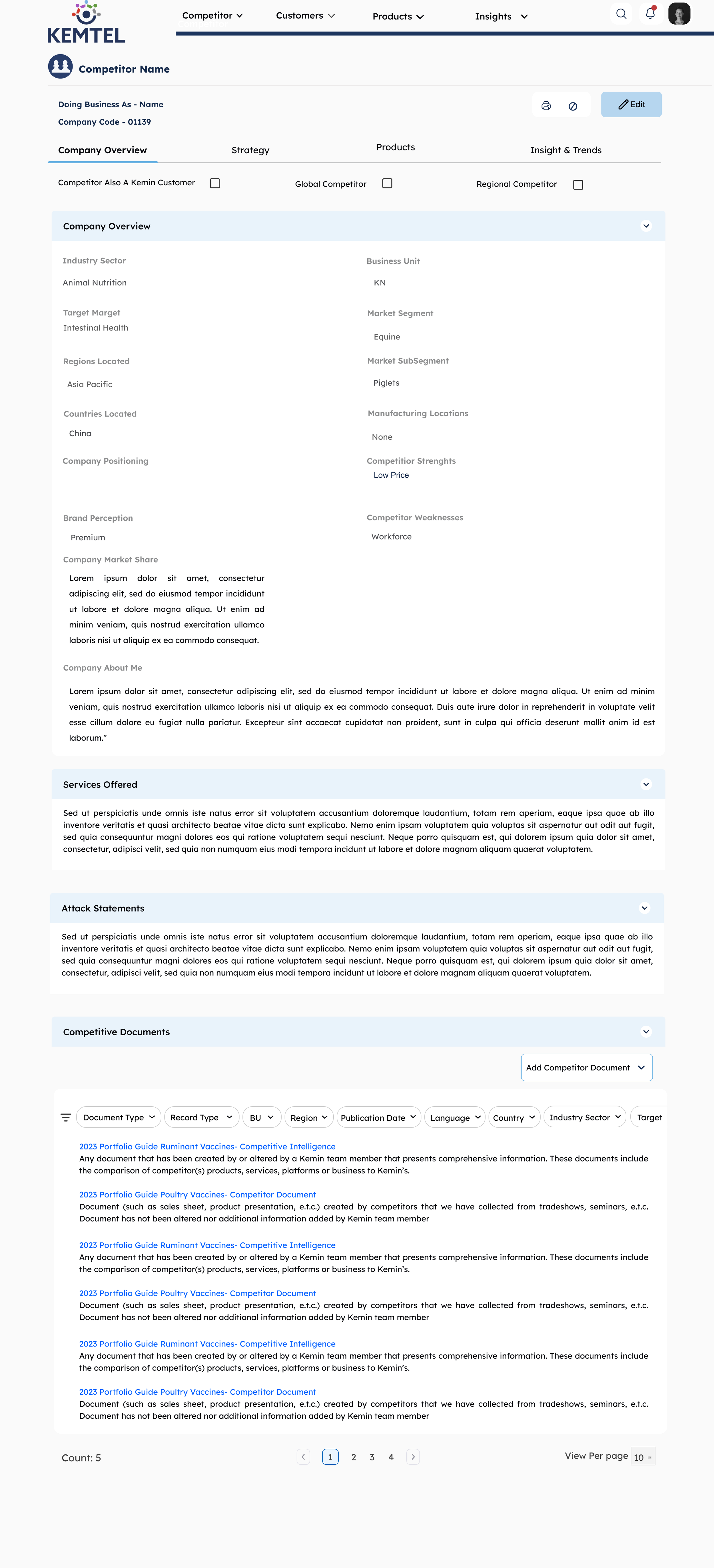
View Mode (Details Screen) - Clean, read-only layout showing validated data with reviewer attribution
Edit Mode (Edit Details Page) - Structured form with clear required fields and validation
This separation makes it obvious when you're consuming trusted data vs. creating new content that needs validation.
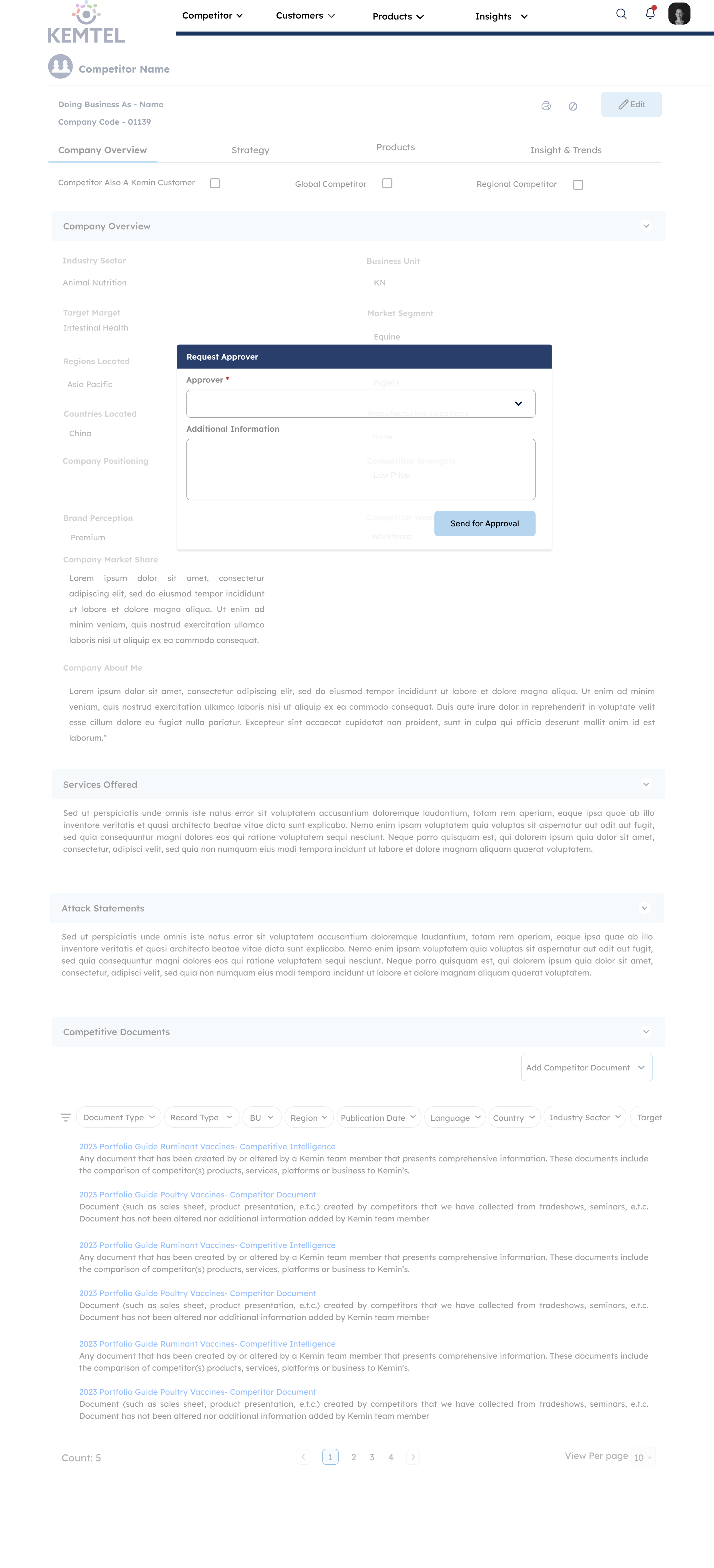
[Wireframe: Request Approval modal]
Approval Request:
Simple modal with approver selection dropdown
Additional information field for context
"Send for Approval" button triggers the review workflow
Clear visual transition from draft to pending state
The Complete User Journey
For Submitters:
Create entry in Edit mode → clean, structured form
Request approval → select reviewer and add context
Track status → see real-time updates in Draft Tasks dashboard
Respond to feedback → threaded comments with timestamps
Resubmit if needed → seamless revision flow
For Reviewers:
Get notified → email + in-platform alert
Review content → see full context and submitter details
Make decision → approve (name gets attached) or deny (must explain)
Provide feedback → comments create dialogue
Track workload → dashboard shows pending queue

Design Decisions
I used orange for "Needs Revision" because it gets attention without punishing people. Blue means someone's actively reviewing. Green is approved. I skipped red for rejection. When something's denied, it goes back to orange. Feels less like a dead end.
I wanted to nudge people toward approval when it's deserved. Red denial requires an explanation, which stops people from rejecting stuff without thinking.
View mode and edit mode are separate. When you're reading published data, you see trust signals, who approved it, and when. When you're creating, you see forms and validation. You need to know which one you're in.
Showing reviewer names was a choice. "Approved by Sarah Chen, Product Director" makes people accountable. Reviewers are more careful when their names are on it. Submitters try harder.
Tabs instead of scrolling because nobody wants to scroll through everything. Product managers can jump straight to Products. Strategy teams go to Strategy. Let people find what they need.
I added comments because yes/no feedback doesn't teach anyone anything. Comments let reviewers explain what needs fixing. Turns the whole thing from gatekeeping into collaboration.
Submitters see their drafts. Reviewers see pending reviews. That's it. No clutter. Different jobs need different dashboards.
Modals force pauses. Requesting approval makes you confirm it's ready and pick a specific reviewer. Denying something makes you explain why. Stops people from being lazy about either.
What I Learned
You can't fix bad workflows by adding buttons. Leadership wanted a draft feature, but that wouldn't fix the actual problem: power dynamics and broken trust. Trust gets built through showing people why something's trustworthy, not telling them it is. Things like reviewer overload aren't edge cases. They will happen. Design it for them up front.
I spent weeks on logic and roles before touching any screens. That's why it worked.
What I'd Do Differently
Should've tested with higher volumes to find where it breaks. Should've talked to reviewers about how it feels to reject someone's work, then designed around that. Training on handling conflicts would've helped adoption. And I should've built an analytics dashboard from the start to track how the system's actually performing.
The best work isn't always what you see on screen. Sometimes it's the logic underneath that makes people trust the whole thing.